
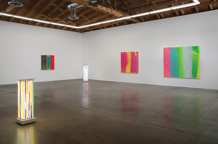
Photo: Robert Wedemeyer; Courtesy Susanne Vielmetter Los Angeles Projects
It is nothing new to speculate that artists have found inspiration in “the unique light” of Southern California; it has been a defining factor associated with the West Coast from the so-called provincialism of the Eucalyptus painters to the innovations of the Light and Space icons. Likewise, Finish/Fetish and SoCal brands of Pop had a look of their own, with an equal infatuation with color, taking inspiration from man-made constructions as varied as surfboards, hot rods, beauty queens and swimming pools. Although this rich source material continues to inspire artists working here, over the past half-decade it seems to have been turned up a few degrees, as though the traditional pigments found on artist’s palettes have been infiltrated by radiated pixels. The soft hum of Lisa Bartleson’s lush primary-hued mixed-media works; Jorge Oswaldo’s graphic manipulations of corporate branding reimaged in neon colors; Ali Smith’s expressionistic vibrant swaths of paint; not to mention Cosimo Cavarello’s public artworks, electric-eccentric oversized jelly bean sculptures recently installed at West Hollywood Park are but a few of the latest examples of this growing phenomenon.
Active within this proliferation, SoCal-based artists Yunhee Min, Heather Gwen Martin, and R. Nelson Parrish each posit a no-holds-barred approach to color, culling inspiration from such varied sources as sunlight, animation, and motion, respectively. Beyond sharing a passionate concern for color, these artists maintain a sophisticated and studied approach, reaching deep into the vast lexicon of modern “isms” to create contemporary mash-ups that simply reverberate with vitality, beauty, and–dare I say–touch of optimism.
YUNHEE MIN
“I think it takes a long time to look at a painting,” states Los Angeles-based artist Yunhee Min. “It is asking a lot, and counter to everything that we do every day. It’s demanding for us to just stop and look at something.” Min’s knockout summer show at Susanne Vielmetter Los Angeles Projects, titled “Into the Sun,” rewarded a viewer’s careful scrutiny beyond the surface appeal of her super-saturated paintings. A combination of primary, neon and fluorescent acrylics–the type that linger in your vision after staring straight “into the sun”–the show reflects Min’s current fascination with colors that seem to radiate from within. “I might begin with a certain set of decisions, such as colors, size of the painting itself,” Min explains. “But it’s not a set process, I’m always looking for some sort of surprise to happen. And, this way of working is fairly different from what I had done before.”
The evolution of Min’s career may be considered a bit unusual by today’s standards. After receiving her BFA from Art Center in Pasadena in 1991, she decided not to go to graduate school. Instead, looking for a change in scenery, the young artist traveled to Germany, where she was accepted in to Kunstakadamie, which she describes as a one-on-one master/apprentice relationship. She returned in 2003, with a solo exhibition at Vielmetter, and shortly thereafter was asked to teach a course at UCLA. Somehow between painting, teaching, working on production sets–where her interest in installation was piqued–she found herself in Boston, where she applied for and was accepted into Harvard University. After a two-year period “thinking about painting,” and “getting no sleep,” as both a student and teaching fellow, she received her MFA in 2007.
At this point, Min’s painting style was strategic: color-field style paintings, consisting of three vertical stripes of color. “I remember making the conscious decision,” Min explains. “I didn’t want to deal with the problem of composition… as a problem. The vertical bands became a kind of structure, so I could pay more attention to color and I could use color more urgently.” Additionally, the hard-edge approach completely removed any indication of the artist’s hand from these works, instead employing a strict formalism to explore not only color, but also space, perception and memory.
While the Sun paintings continue the vertical orientation of the earlier paintings and installations, there is an open-ended quality in the newer works. The layering of pigments in various degrees of translucency allowing viewers to glimpse beneath the perceived surface. The highly physical process, applying the thinned washes of paint with a squeegee instead of a brush, also reintroduced traces of the visible interaction between the artist and canvas. “In some ways it is antithetical to the historical, early modernist notions of abstraction always distilling to some ideal utopic state of purity,” Min explains, “For me it is more about the potential for new things to happen, and new relationships to occur.”
In this latest series of work, Min chose to work with a combination of acrylic and flashe paint, noting the highly concentrated pigmentation and her attraction to the spectrum of fluorescent colors of the latter. “I think there is something ‘West Coast’ here,” Min says as she notes how the brightening of her palette followed her return to the southland. “Colors can be specific to culture, to a region, and can work in a very culturally or regionally specific, symbolic way. I’m interested in all this, and I think it works through me.”
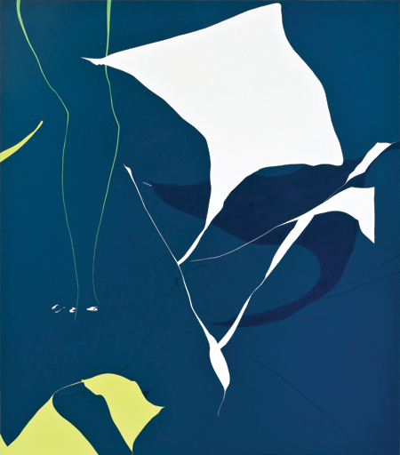
Photo: Gene Ogami, courtesy Luis De Jesus Gallery
HEATHER GWEN MARTIN
In marked contrast to the vertical linearity and translucent layering in Min’s paintings, are the bold patterned, crisply delineated paintings by Canadian-native, San Diego-raised, Los Angeles-based Heather Gwen Martin. Martin’s previous body of work might be best described as a buoyant Pop-Post-Minimalism. Confounding years of modernist experimentation, the large unmodulated planes of opaque candied colors found on Martin’s canvases are decidedly not flat; while the forms may be reduced, they are not reductive in the typical Modernist blueprint. These unrecognizable organic forms could just as easily be read as zoomed-in detailed views of balloon animals or Technicolor-rendered cat scans. A unique combination to be sure, think: Jean Arp meets Ellsworth Kelly meets Tex Avery, with a dash of influence from veteran Pattern and Decoration painter Kim MacConnel, with whom Martin studied during her undergraduate years at UC San Diego.This season, Martin’s work has been especially visible: as part of the recent “Rogue Wave 2013” group show at LA Louver gallery that closed August 23, and as the subject of a solo show at Luis De Jesus Gallery, opening September 7.
Standing with the artist in her studio overlooking the downtown skyline, surrounded by her new works the color palette maintains the luxuriant brilliance of her earlier series. And yet, there is a subtle shift. The frenetic energy of the previous series has evolved into a more lyrical sense of movement, pulling the viewer’s eyes slowly through the canvas.
“What I’m interested in right now are the ideas of how twisting shapes and colors push each other around,” Martin says motioning to the recently finished paintings hanging in her studio, “the harshness of bold contrasts, next to some of these really subtle shifts, and how the different colors inform one another.” Further defining her interest and careful studies of color, she moves across throughout her studio, motioning toward different works, “How the green here appears to be lit from within” and how “the light blue here almost seems to be brighter than the white” in another.
Noting the consistently bright palette throughout her oeuvre, it seems fitting to learn that Martin had worked for years as a digital colorist for comics and animation. Though working with digital processes may have swayed many artists to further explore the possibilities of new media, it seems to have had the reverse affect on Martin, whose choice is most traditional: oil on sized linen. “I use an oil ground,” she explains, “it’s really smelly and really messy and takes a week to cure, but it creates a really nice surface to work on.” Applying the ground with a palette knife creates an unusually smooth surface, with brief interruptions created by the knife’s edge, adding a subtext of texture to the artist’s sharp edges and exquisite line work.
Though the seamless edges and application of paint may suggest an interest in removing a sense of self in the work, the opposite is true. “I’m very interested in conveying the human experience,’ Martin explains and recalls her delight upon first encountering a brick-and-mortar Mondrian; how the iconic painting style, after seeming so perfect in reproductions, was in reality so imperfect. Turning again towards her work, Martin points to the meandering lines of unequal thickness, organic forms, and how each often trace the arc of her arm moving over the canvas. “The paintings are quite reduced, but I wouldn’t call them minimal,” she states, “because they come from a feeling, a scenario, an event, where there is an energy that is very much related to the idea of being human.”
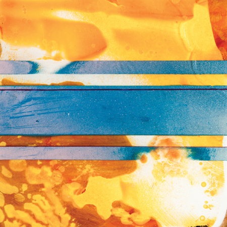
Photo: courtesy Edward Cella Art + Architecture
R. NELSON PARRISH
The human experience is also at the core of the translucent resin-on-wood works by Santa Barbara-based R. Nelson Parris, while adding equal parts of art history and adrenaline to the mix–an unusual combination to be sure. Heir apparent to the experimentations of the Light and Space/Finish Fetish crew, R. Nelson Parrish works predominantly in resin, and finds influence in the light, surf and car culture of Southern California; but the Alaskan-born artist also credits his athletic interests as an equally vital, if unusual, influence towards his work.
In many ways, Parrish represents the opposite end of the equation from both Min and Martin. “I thought the only way to work with color was to paint,” the artist begins as we sit in the middle of his recent solo exhibition at Edward Cella Art + Architecture. “However, I didn’t feel like I was adding value to that conversation, so a lot of the materials I chose were about removing myself from that conversation.” He delved into color theory while earning his MFA at UC Santa Barbara, where he also first began to work with resin, his current medium of choice. He also actively sought a means to create work that would accomplish the “pure removal of the artist’s hand.” But while it may seek to remove any physical evidence of the human experience, it also absolutely revels in it.
Arriving at art though a self-described series of injuries, the former speed skier describes art and athletics as “two sides of the same coin.” He enthusiastically describes his research as surfing, biking, jumping out of airplanes, and moving through the landscape, whether on skies or in a vehicle, at extreme velocities. The same sense of complete focus, of being in the zone, applies to his intense working methodology. And though the artist’s palette is derived from the landscape, the hues are high-keyed versions of the source material. In the multi-piece series, Light Over the Pacific, Parrish captures the passing time, inspired by the famous stretch of PCH at Point Mugu north of Malibu where the coolest shades of cobalt and teal are set against high-voltage variations of orange.
“My favorite brush is an eight-inch wheel grinder,” he jokes alluding to the numerous hours of concealed work, sanding the layers of pigment-infused resin. Concerning the materiality of his work, Parrish continues the legacy of SoCal legends, while also turning such references on their head. Referring to the works he calls totems, he readily acknowledges the association of his work with the historic planks of John McCracken, while also referring to Turrell, Rothko, Judd and Richter as influential to his practice; looking at the deft flow of pigmentation within translucent layers of resin, one may be tempted to throw fellow surfer Peter Alexander into the mix. However, this transparency visually also sets his work apart from his predecessors, as Parrish reveals the wooden plank supports beneath the surface.
The seemingly organic physically of the wood, along with the meandering flow of pigments washing across the surface in interrupted by fine threads and bold “racing stripes.” The contrast between natural and man-made may not be what the viewer expects. “The racing stripes are in their natural state,” explains Parrish, “while the wood has been harvested and milled and shaped into something unnatural.” The seeming contradiction brings back the inherit exhilaration of Parrish’s love for the landscape, not only as source material, but as visceral experience; the stripes of color alluding to his movement through it at breakneck velocities.
For Parrish, the paradox is essential. The multiple dichotomies of synthetic/organic, orderly/chaotic and even artist/athlete, coexist quite naturally. Capturing these experiences and translating them through an abstract language of color, form and line suggests that perhaps the modern/contemporary duality is part of our current cultural landscape as well.
Originally published in art ltd. magazine (Sept/Oct 2013)